Well, here we are again. In the world of design, there are always a few bad apples that make us all cringe. And when it comes to logo design, there are some truly cringeworthy fails out there. We’ve shown you a few nasty ones last time (want to see it again? You can find it here. Now we’re back for more! So sit back, relax, and enjoy the show!
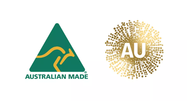
Don’t know how you get from a kangaroo to a pandemic inducing virus, but this was one of the biggest Australian rebrand fails of the past decade. And so timely too! It might not have been that bad if it wasn’t for Covid, however that still wouldn’t have saved them!
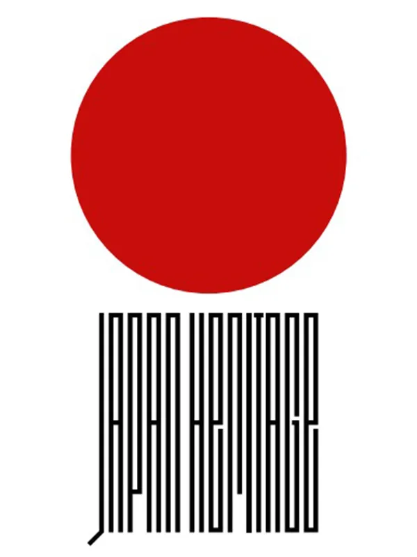
It almost looks like it’s written in Japanese, which in a way is good, but at the same time, as you may agree – its not negligible in any way or form!
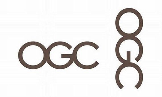
The Office of Government Commerce (OGC) was a UK Government Office. Just don’t look at their logo sideways. (have to admin, took us a little bit of time to get this one)
![]()
One of those classic ones that has been doing the rounds for some time now.

I always loved sausages, but this just kind of rubs me the wrong way.
![]()
I think Kudawara Pharmacy needs to review the qualifications for their back-end, I mean, front-end people.
![]()
Seriously?! This is a logo for clothing?! At least you can easily read the word CAT here!
![]()
Looking too happy there Mr. Mont-Sat.
So, there you have it. These are just a few of the worst logo design fails we could find. If you’re thinking about designing a logo for your business, be sure to avoid making any of these mistakes. A good logo can help your business succeed, while a bad logo can do the opposite. And if ever you’re having trouble, for the love of god! Just give us a ring.
And we shall collect a few more for you next time!