They say that among the most significant marketing tools, is a well-designed company logo. Not only does it provide the capability to produce a recognisable identity for your business, but also communicates exactly who you are (or how you want to be perceived). Think of the logos you know, the business and their brands are intrinsically associated with their products. For this reason, every company considering designing a logo should know the criteria that make for an effective logo.
A good logo will be able to catch a person’s interest. Your company’s logo could have this feature, but that doesn’t mean that it’s performing to the benefit of your company. Nasty messages may appear only after rotating your logo by a few degrees or seen in another country. You can’t always get it right 100%. In fact, sometimes, getting it wrong isn’t that bad overall – people remember you. As they say – there is no such thing as publicity. Not until you see some of the logos we’ve put together here… and that’s just the beginning. There are more to come!
And also, these regrettable logo decisions are amusing to us, maybe not as much as to the business owner or to the designers who created them. Here’s a rundown of design mistakes that may have seemed unlikely at first glance.
![]()
Probably not the most widely known pediatric clinic in the area.
![]()
In 1973, this was the symbol of the general affairs commission for all minors.
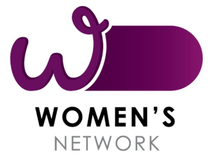
Another unfortunate fail by the Australian Government (you’ll see the other fail in our next edition). A logo for an Australian government office’s Women’s Network campaign has drawn criticism on social media for resembling … you know what.
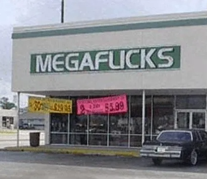
We think this video store regrets its use of this particular font. Wait – a video store? These don’t even exist anymore.
![]()
Locum, a property management company based in Sweden, used this “festive” version of their logo during Christmas.
![]()
Tilt your head to a side and follow the dance flow.
![]()
This is what happens when you are trying to illustrate someting too literally. On one hand, this isn’t necessarily wrong. On the other – there are many things wrong with this logo.
![]()
You’re right, it’s just a tiny house sitting in the sun’s rising glory.
![]()
It is probable that this double meaning was intended to be made by the author. For that reason, it is probably more a WIN than a FAIL.
![]()
Luckily the mouse is now cordless in most homes