Visit any website these days and you will probably come across the Hamburger. The hamburger menu icon is just one of the ways designers are making websites look and feel simpler. The minimalist user interface is one of the biggest web design trends in the last few years. However, what is the advantages and disadvantages of minimal navigation in web design?
What is Minimal Navigation in Design?
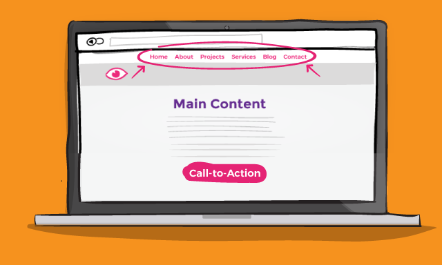
First, let us define minimal web design. It means removing everything except the irreducible minimums necessary that ensure usability in web design. For instance, tabs, menus, and content that are unnecessary are removed while the most necessary elements are retained and highlighted. The point is to take as much clutter away as possible: no tabs or pop-ups or dropdown menus.
Minimal navigation on a website means that the navigation is kept to a minimum. Users of the website should not have to do a lot searching, browsing, or even clicking to get to the information they want. Because it results in positive user experience; minimal navigation websites have become a trend in web design in Sydney, and indeed, around the world.
However, just like any trend, there are pros and cons to minimal navigation design.
Advantages and Disadvantages of Minimal Navigation in Web Design
Let’s start with the advantages.
- Small is the New Black.
Because everything is done on mobile devices these days; people have become accustomed to small elements such as the hamburger menu and other streamlined items. Users are then confused or become frustrated when a website assaults them with too many elements.
- It’s easy for the users.
People nowadays are seemingly always on the go. Minimal navigation styles help users find out what they want in the least amount of time and with the least amount of effort. Websites that make people do a lot of things lose those people. Experts in UI and UX design in Sydney take ease-of-use very seriously because the fewer users have to do to get what they want, the longer they stay on your site.
- No information overload.
Minimal navigation leaves room for expansion (i.e. pop-out menu or extended navigation panels). If and whenever possible, designers can offer additional information and content neatly tucked away. That’s the best part: everything is flexible without overloading the users with information.
- Design Your Heart Out
In a minimal navigation design, the canvas is clean; leaving you with room to design to your heart’s content.
- Clear Call to Action
Minimal navigation also leaves room for clear calls-to-action or other elements you want to highlight for your users to see and respond to.

Now, let’s talk about the disadvantages.
- Users Might Need a Map
Users, especially those unfamiliar with icons, might get lost. You might want to study your site’s analytics to remedy this issue and plan your design elements and icons accordingly.
- The content might be buried.
Minimal navigation keeps a site’s content hidden somewhere. This might lead to users not finding what they are looking for. The clever design will help keep navigation to a minimum but still show the site’s content.
- There is potential for low engagement.
Some users might not recognize icons such as the hamburger. Ergo, they don’t engage (click). For this, consider using buttons because they tend to be more clickable.
- SEO might be slightly negatively impacted.
Fewer words or other content on the page make it difficult for robots to understand what’s on the site.
- There is potential to overdesign.
With room to design, the icons or buttons users need to click on to move through the pages might get lost in the graphics.
There is a lot of room for creativity and innovation in the minimal navigation website design area. It also offers a lot of opportunities as well as challenges. There are obvious advantages and disadvantages of minimal navigation in web design. Nevertheless, web designers must evolve and continue to get on with the times.