The challenge.
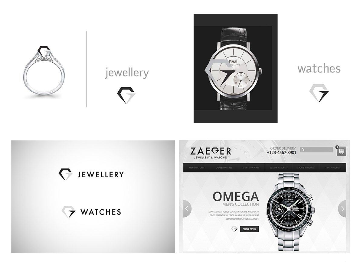
Create a logo that says something about the diamonds side of the business, the luxury watches side of the business and also a little about the company itself. The office is located in the heart of Sydney, on one of the top levels behind a security door. Not the type of retail store you would usually walk past.
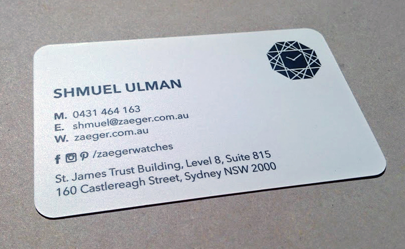
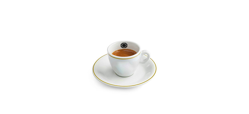
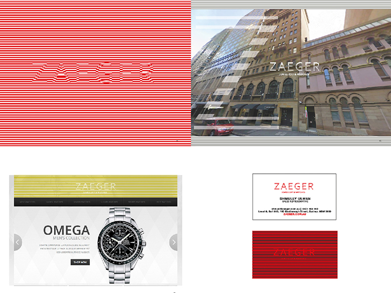
Business card front. Simple, elegant, informative.
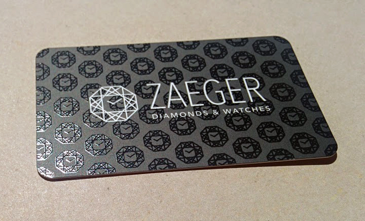
Business card back. Corporate pattern was thrown together and presented in a classy UV-spot finish.
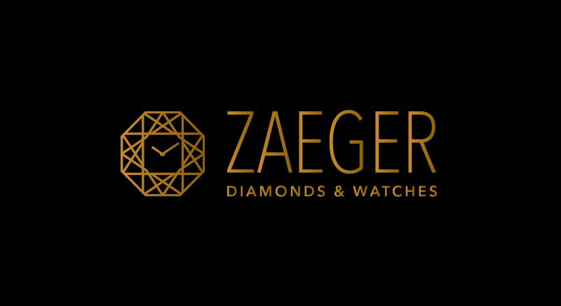
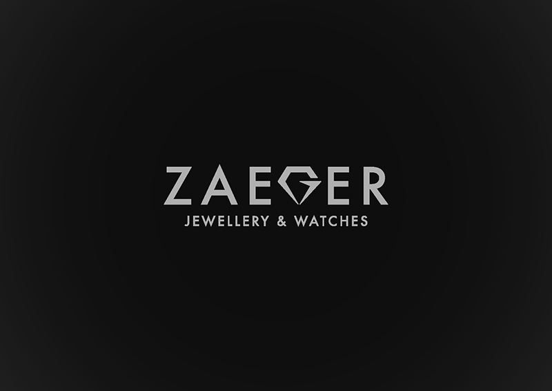
The logo with a golden tint on black background. The icon has a bit of everything in it and if you deconstruct it – you may be able to figure out what the main structure of it is. Still don’t get it? Get in touch with us and we will reveal a small secret.
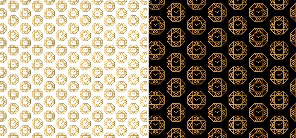
And of course, we created a beautiful, but simple corporate pattern to go with the brand.
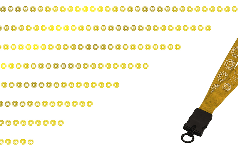
Ready to get out there, conferences and exhibitions.
If you are ever in the area – come check out their store. Just remember one thing – this isn’t your usual jewellery store. You’ll feel like a celebrity going into this one with all the security checks.
Behind the scenes
Another logo presented. This was partly based on what the client already had, but it needed a cleanup and direction.
And this is the direction.
A more risky concept was also presented. This takes the client on a journey to a mysterious place with a product that is something only to desire. Concept was, as you’ve guessed, rejected.
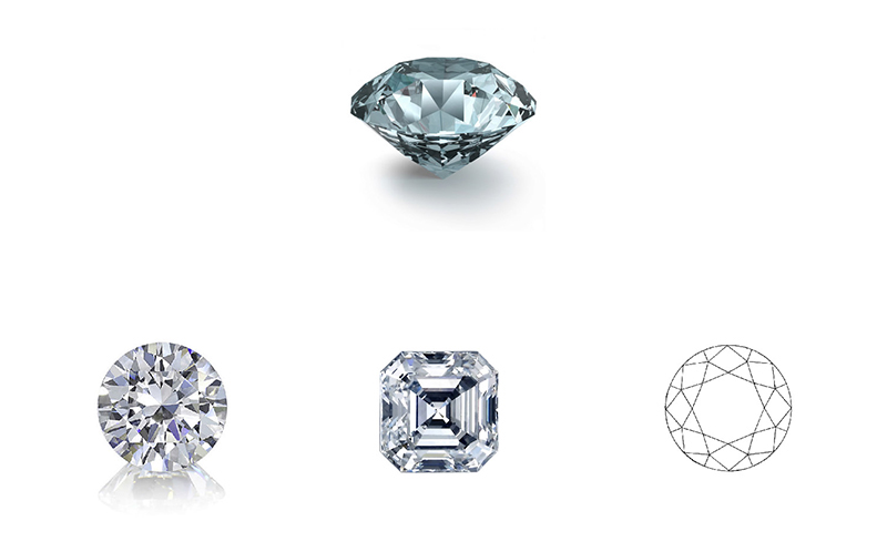
We then decided that it was time we study the jewellery a little more. What is a diamond? And why is it in most cases, it’s presented from a side-view, when all the beauty lies in the heart of it.
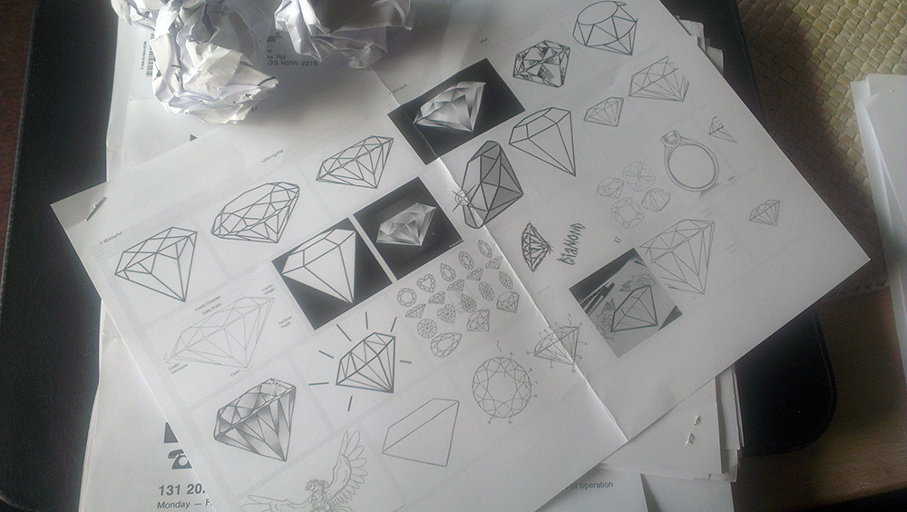
We searched the web and found a variety of images. We printed them out and took out a sharp pencil. The side view of a diamond wasn’t working, we had to change the view perspective and start from scratch.
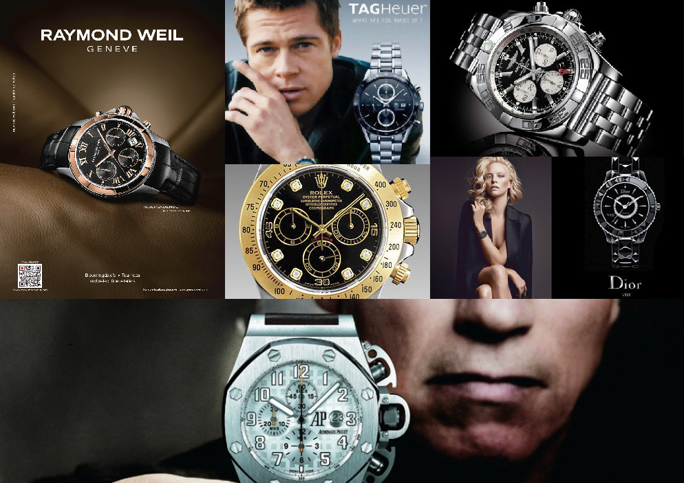
Diamons aside, we looked at the watch. Let’s not reinvent the wheel and use something familiar here. I’m sure most of you have noticed the time on majority of watch ads. This is all we needed.
Corporate identity and stationary for a luxury watch and jewelery store, based in Sydney Australia.
ClientZaeger — diamonds & watchesServicesGraphic Design,Corporate Identity,PrintYear2013