And this is how the golden ink was chosen in the print.
Corporate identity / stationary for, as described by the client: "Le Défilé is created for a special woman — beautiful, unique, magnificent, for the one that chooses only the best and most exquisite!".

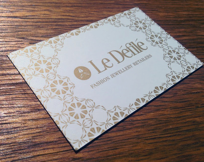
We worked out a design that was both elegant and corporate and with a touch of gold ink – it was the perfect combination.
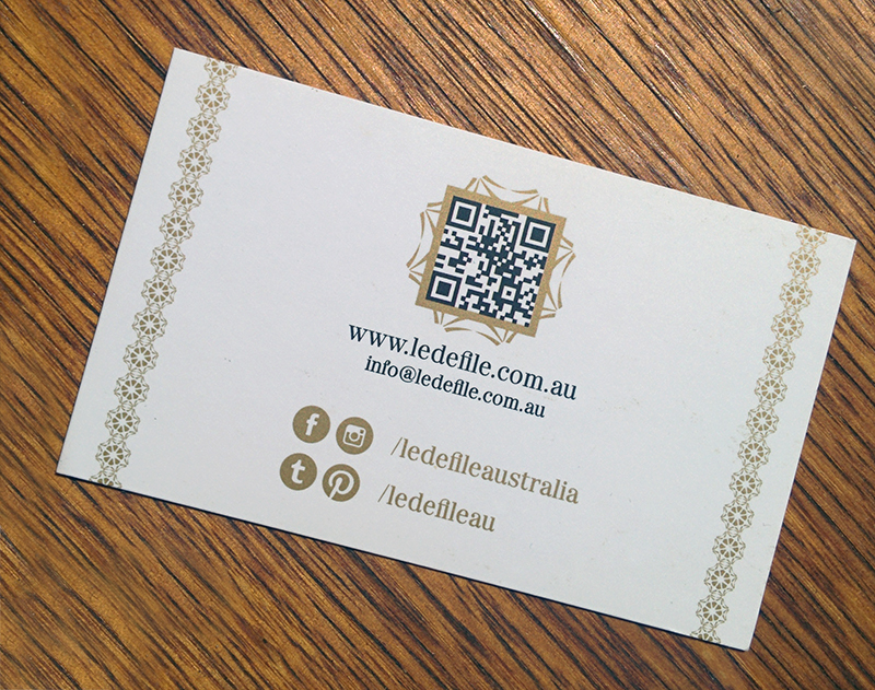
It’s getting harder to grab all the social media names you want with your unique company name. This was a good solution and we made sure it was visible and clear.

And of course, the pattern multiplies and creates beautiful backgrounds, side bars and so on.
Behind the scenes
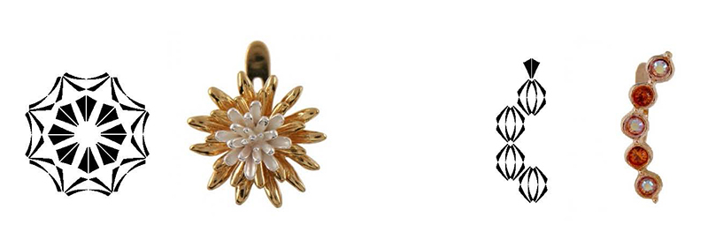
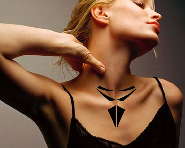
Instead of trying to figure out an image that represents all jewellery pieces, we came up with a structure where the logo itself is just a tiny particle of them all. The logo can recreate most, if not all the jewellery pieces in the collection. Just use a little bit of imagination.
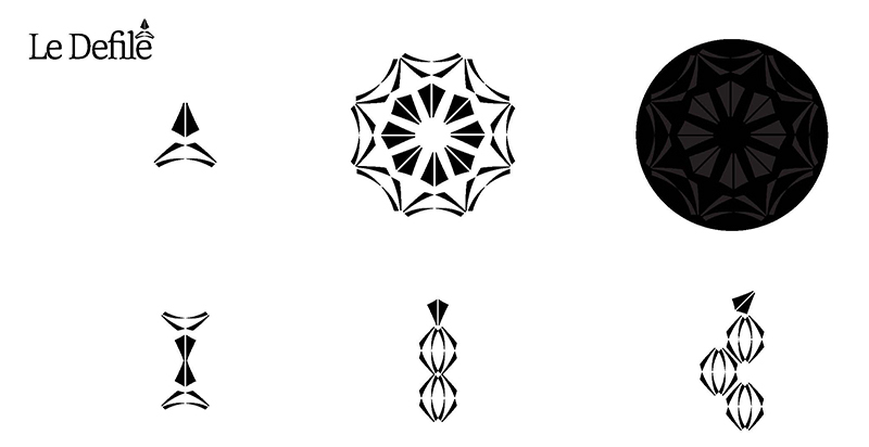
And of course, this is how the pattern was also born.
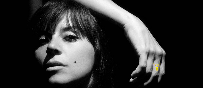
The logo can be used in advertising in a very mild, but powerful way.

It can be placed in places where one would not notice it at first glance. It’s playful. It’s surprising.
You can even blow it up and make it the center-piece of your ad. It’s your playground and you are calling the shots.
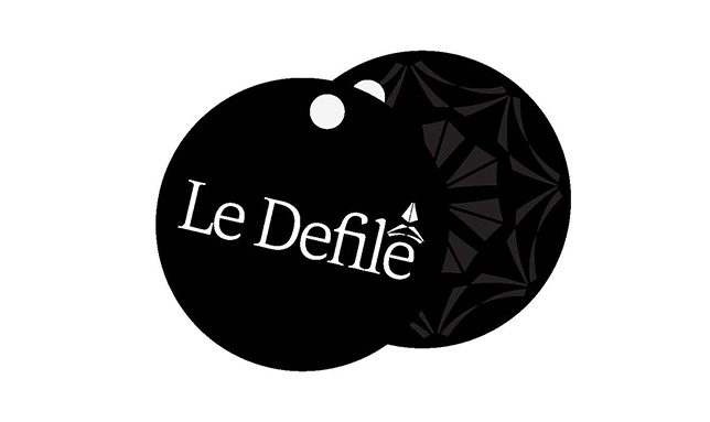
Tiny tags to go with the jewellery when sent to clients. This was only a concept and we are still to look into this further.
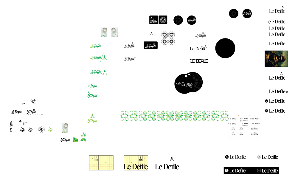
A birds-eye view of some of the process.
“Le Défilé is created for a special woman — beautiful, unique, magnificent, for the one that chooses only the best and most exquisite!”.
ClientLe DéfiléServicesGraphic Design,Corporate Identity,PrintYear2013