Pro bono project:
Branding identity, stationary and ongoing design for F.R.E.E. Soup Kitchen, a newly formed non-profit organisation to feed the poor. Organisation is run by a small Sydney jewish organisation, F.R.E.E (Friends Refugees of Eastern Europe) Chabad of Bondi. The aim of the logo was not to be 'too jewish', as they offer their services to a wide community of people, located in the poorer suburbs of Sydney.
What FSK are all about in just over 5min.
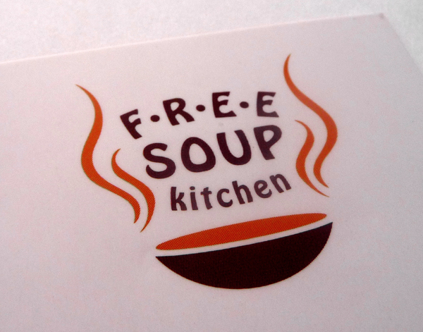
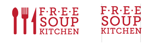
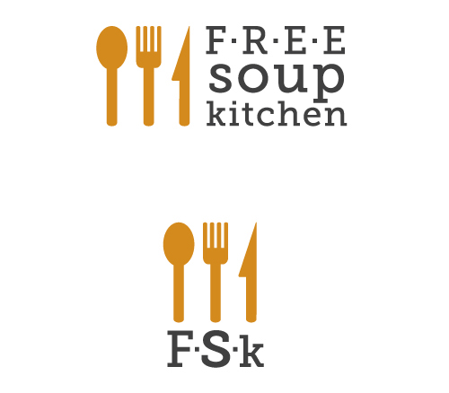
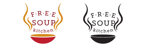
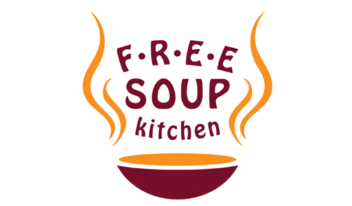
Logo indirectly symbolising both a plate of soup and the jewish charity group behind it.
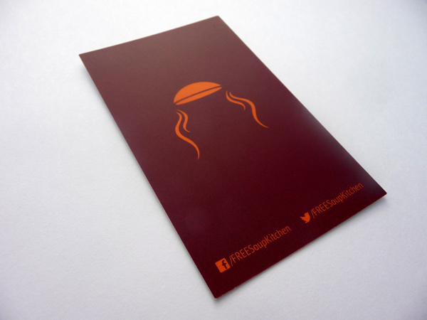
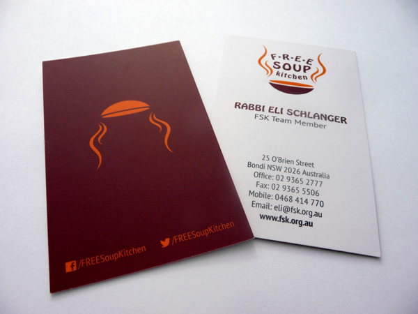
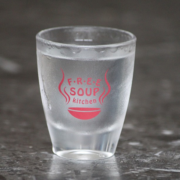
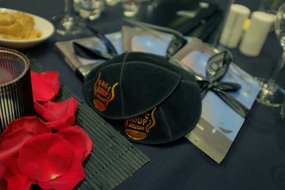
Business cards for all staff members, simple and clear. Revealing the ‘jewish twist’ behind the logo and getting ready for the annual Gala Dinner with branded shot glasses.
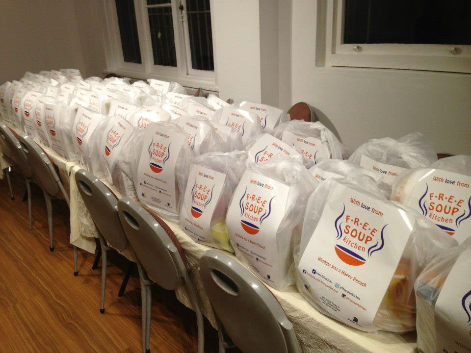
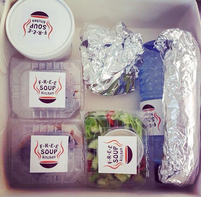
Bags of food packed and ready to be distributed.
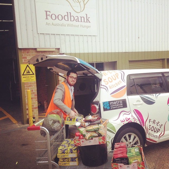
The newly branded car is packed to the max
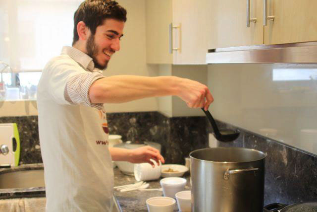
Cooking a hearty meal
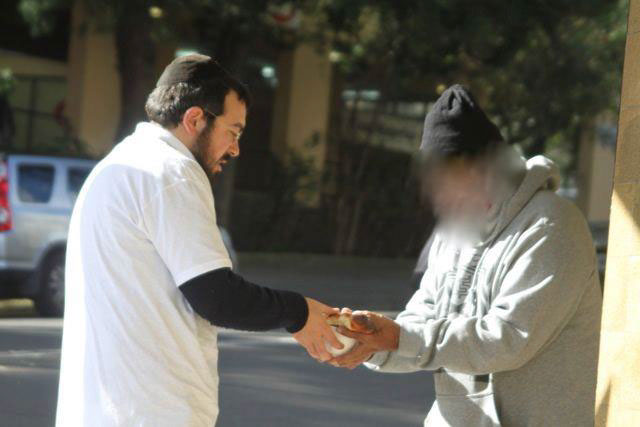
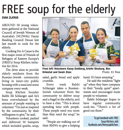
Feeding the less fortunate around Redfern, NSW
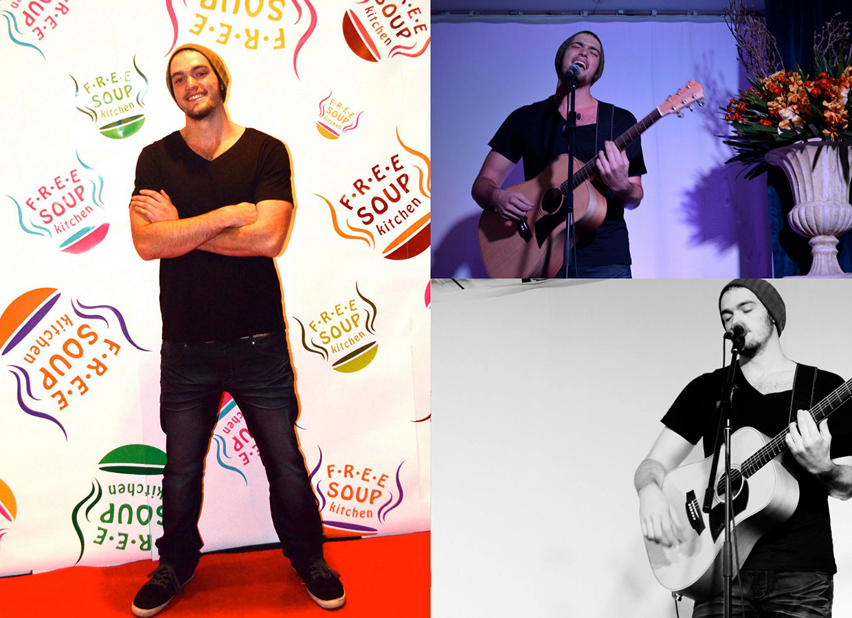
FSK at events and in media
As FSK grows, Shtudio supports it alongside all upcoming projects and events.
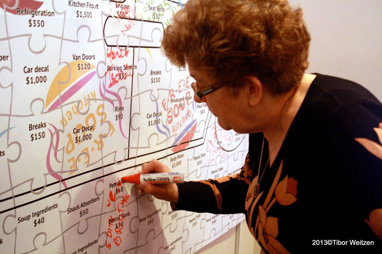
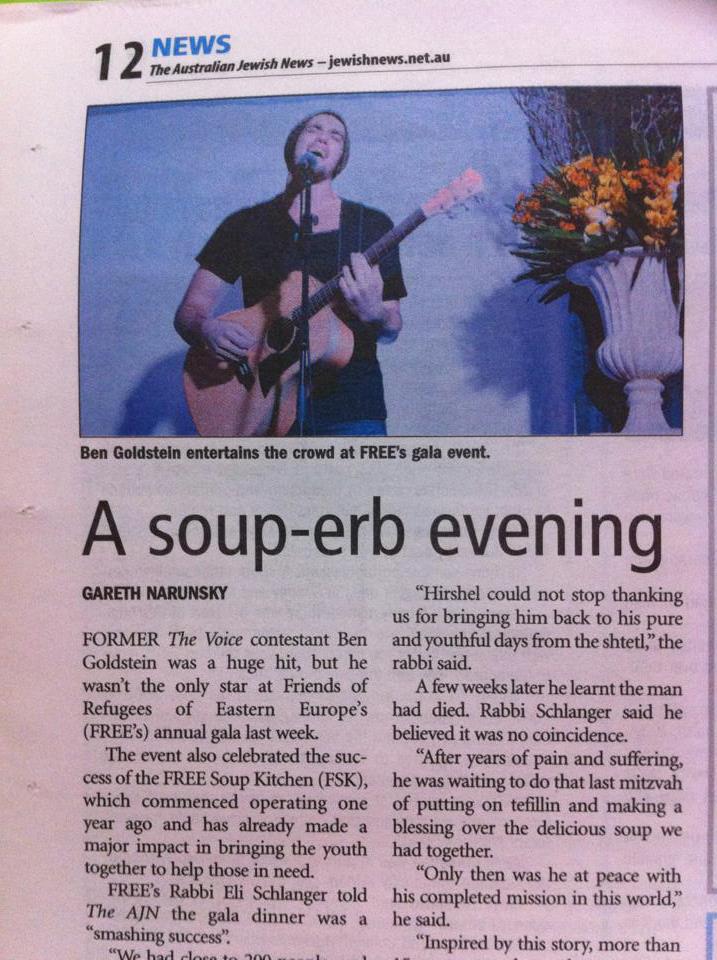
Photos from the 2013 Gala dinner and FSK soft launch event. Ben Goldstein from The Voice made an appearance. A large banner was designed with puzzle pieces that people can “buy” by writing their name in the pieces and donating the shown amount. Later the money will go towards an actual van. And a media wall designed to capture the happy brand and the generous people in front of it.


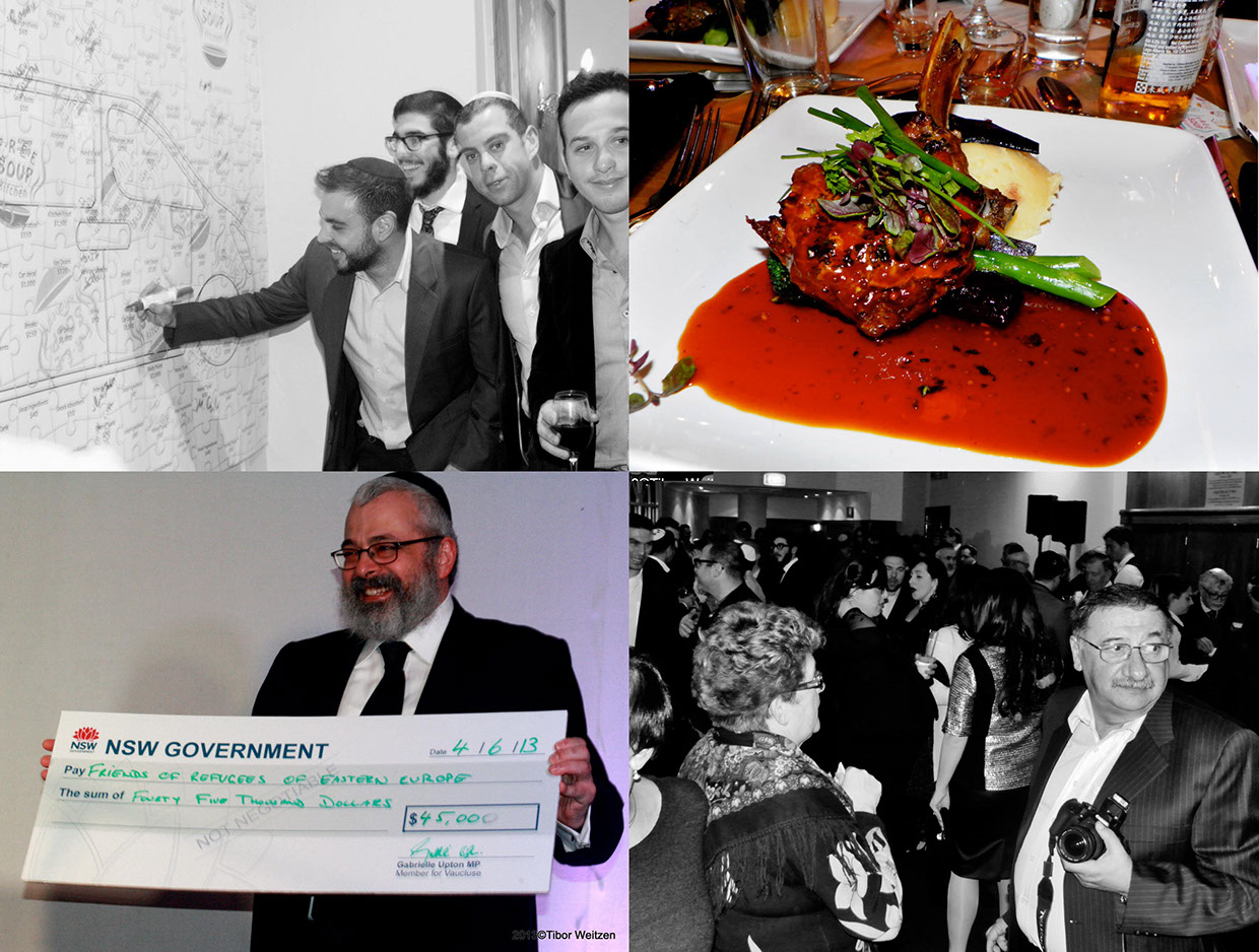
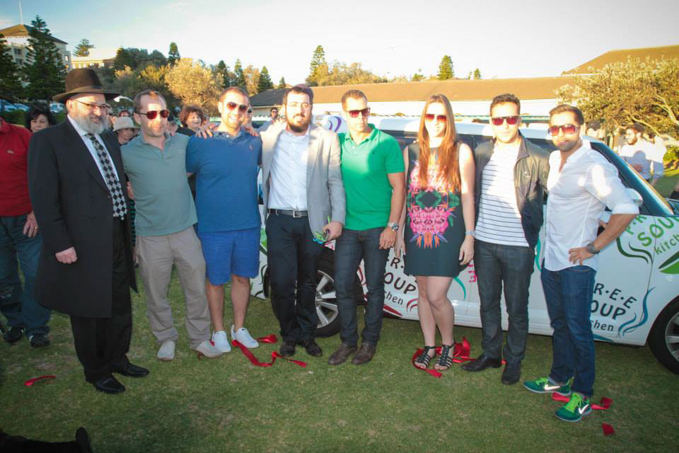
Some of the supporters and those involved in both designing the car-wrap and running the day to day charity activities.
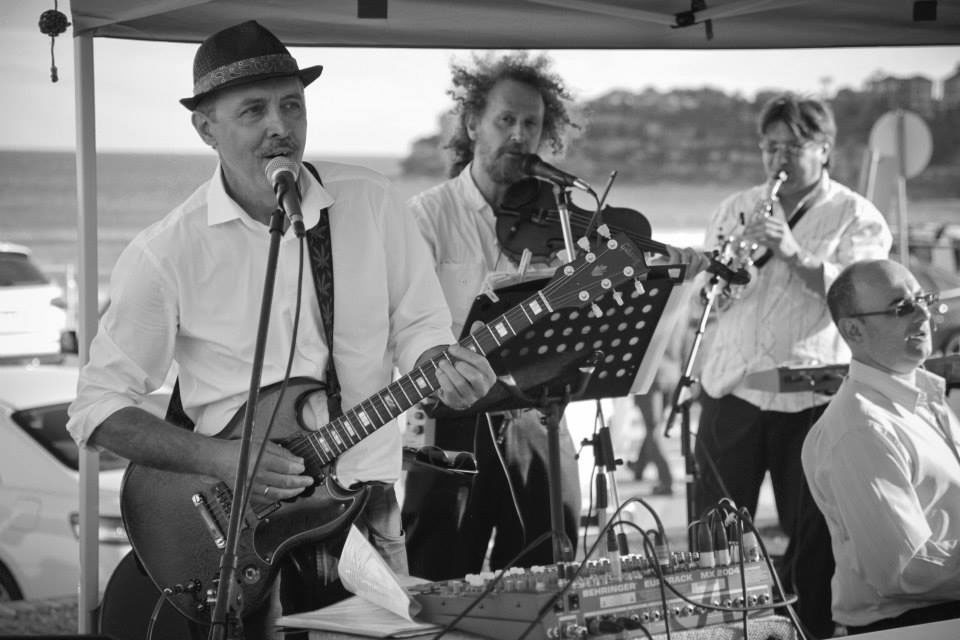
Entertainment for the day of the new car launch and big Chanukah event on Bondi Beach
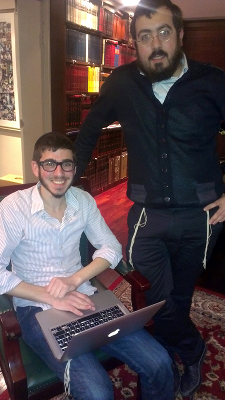
Shmully and Eli criticising our work 🙂
Behind the scenes
Idea one – it’s not just about soup.
Slight colour changes and getting the FSK out in the open.
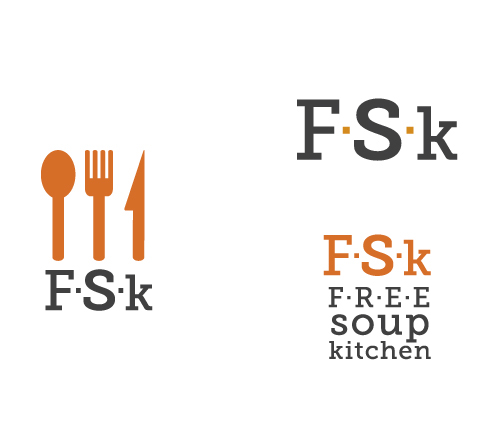
This could work. The client didn’t mind it and we could see this progressing.
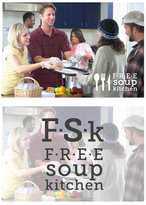
Let’s try the logo on some stock photos now.
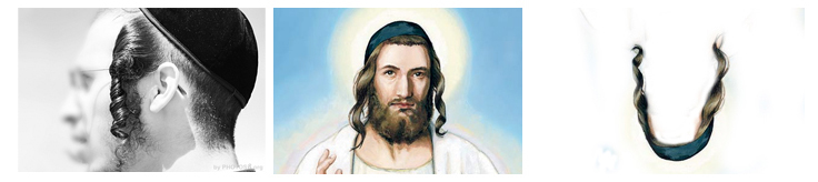
Ok, here is an idea. Payot and kippah.
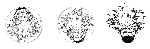
There is something about this dude’s beard and a steam coming out of a nice dish full of food.
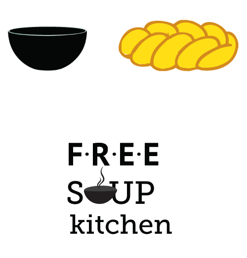
Thinking further. Thinking of possibly giving it somethig jewish, even though the client asked for this to be generic. A bit of challah in the mix? Who doesn’t like challah?
This is begining to make perfect sense now. Not jewish, but has a jewish twist, literally.
Font updated, everyone is happy.
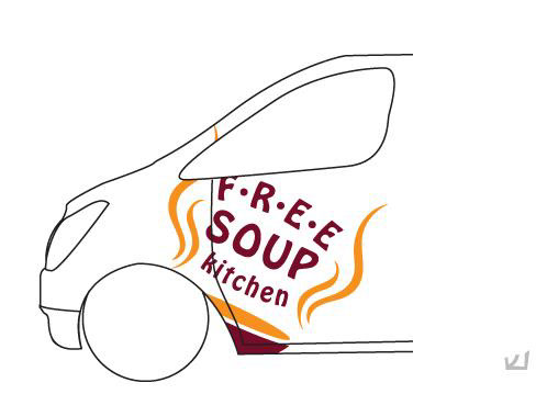
Next project – van branding. You can see more on this here.
Corporate Identity for F.R.E.E. Soup Kitchen, a non-profit organisation in Sydney, Australia.
ClientF.R.E.E. Soup KitchenServicesBranding, Graphic Design, PrintYear2013