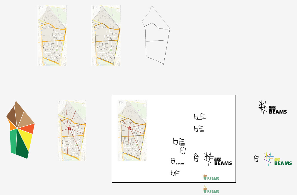
We placed the suburb into the logo, not the other way around. Chippendale is now in the heart of the annual festival it puts on.
— Thank you to the UTS crew
This fantastic promo video for the logo and event was done by these guys:
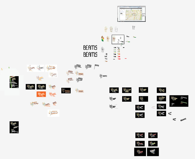
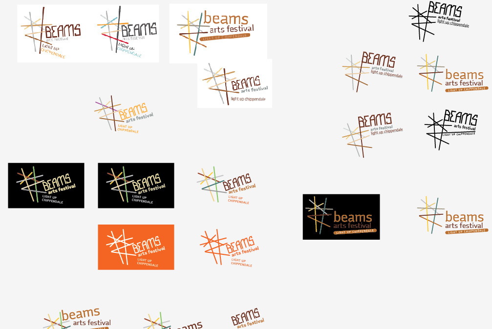
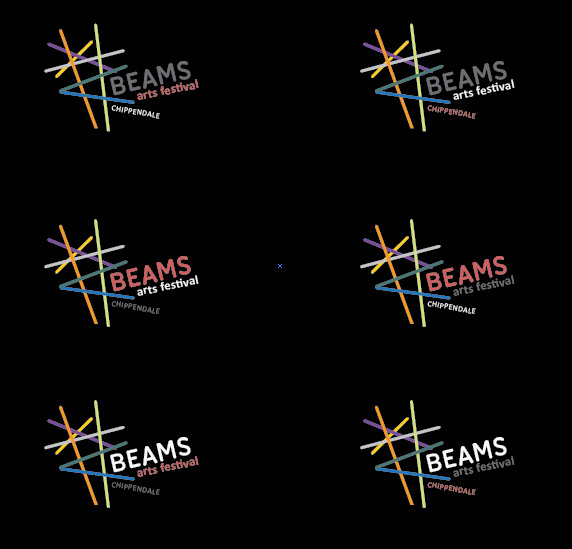
Logo and it's usage
The final logo and some mockups
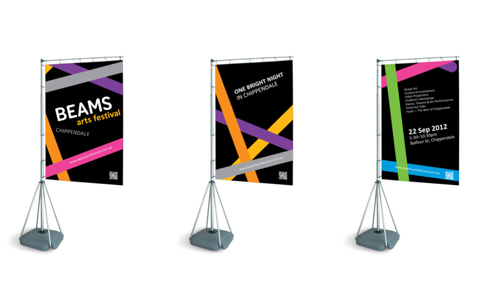
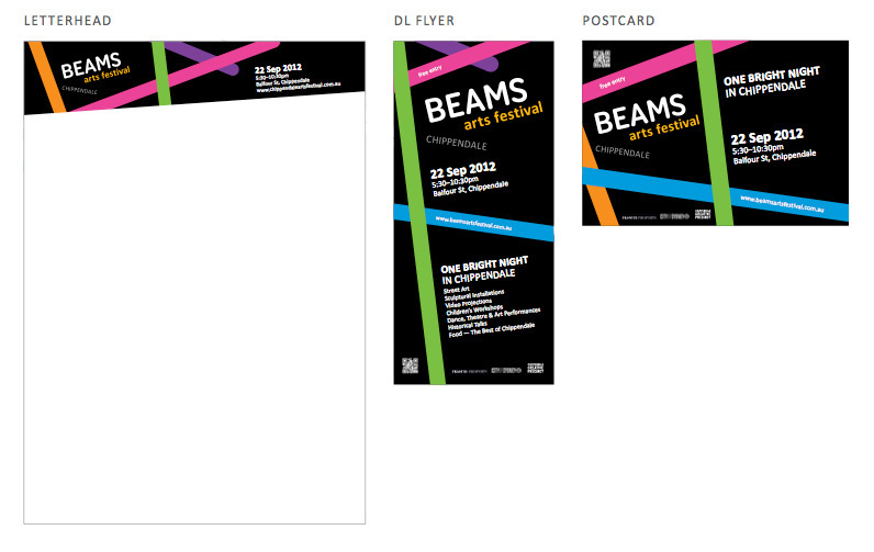
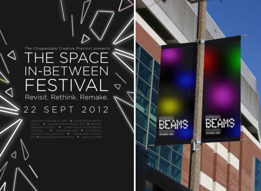
Some stationary and promo material, Promotional stands, that never really got made and the website that was designed by Dane. Just some of the things that were quickly thrown together

Live shots
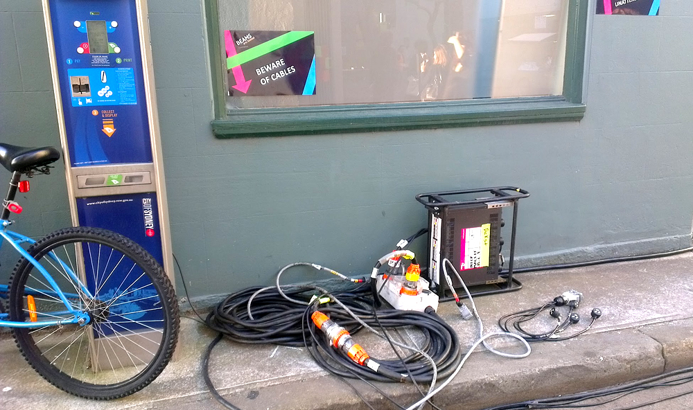
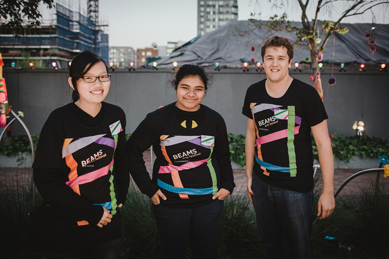
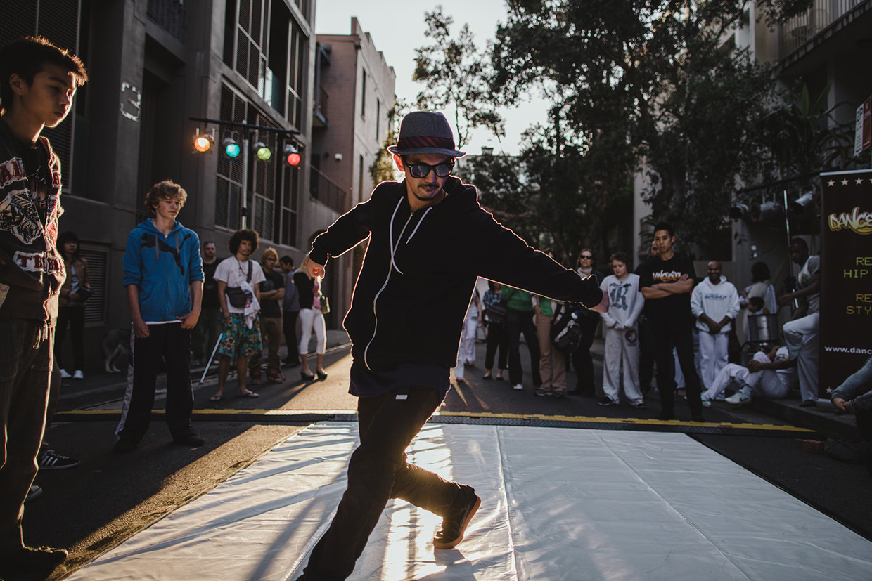
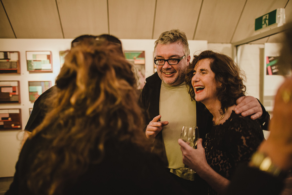
Photos from the actual event
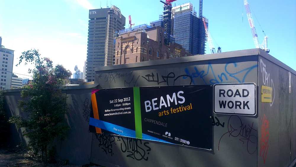
Signage with a view
The guys at CCP took the branding guidelines and made it work quite well
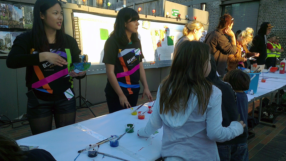
BEAMS tshirts. Nice and bright.
Photos by: unknown
In the media
Event has been running annually from 2012. Here are some of the initial reports.
http://www.broadsheet.com.au/sydney/weekend/article/new-world-city
http://sydney.concreteplayground.com.au/event/149651/beams-arts-festival-2013.htm
http://www.aroundyou.com.au/articles/top-10-september-things-to-do-in-sydney
http://www.bordermail.com.au/story/1742297/ticket-sydneys-hottest-shows-for-september/?cs=53
http://www.au.timeout.com/sydney/art/events/35962/beams-2013
http://www.broadsheet.com.au/sydney/events/event/beams-festival
http://www.sydneyunleashed.com/events/?id=96&vid=69
http://century21synergy.blogspot.com.au/2013/08/take-five-minutes-to-learn-about-rhonda.html
Behind the scenes
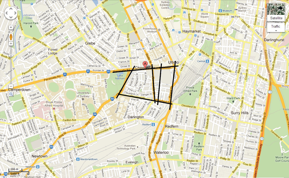
First, we studied the map.
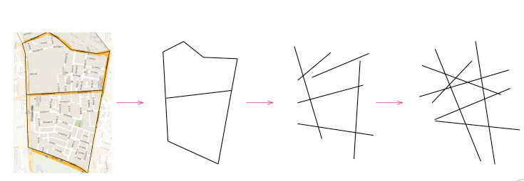
Then — we let it go “free”.
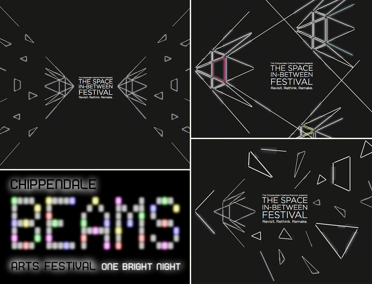
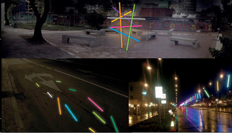
Some mood frames to get people excited about the brand.
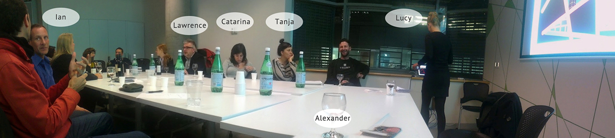
The presentation day to a variety of people from Sydney City Council, Chippendale Creative Precinct and others from art galleries, marketing and design firms.
The objective here was to design a brand for Beams, a five hour arts festival in the newest hipiest part of Chippendale. The team consisted of students, experts, a professor and an art director, working together as a part of UTS. Shtudio was not directly involved in the project, of the Shtudio’s designers’ was on the UTS team.
BEAMS Arts Festival Chippendale. One bright night.
ClientChippendale Creative PrecinctServicesLogo design, corporate identityYear2013Linkbeamsfestival.com.auDesignCatarina Araújo; Tanja Binggeli; Lucy Klippan; Alex VlassovProject managementLawrence Wallen (head of school, design); Ian Thomson (art director)