We’ve updated our logo (again). We actually do this every few years.
Why?
Well, simply said — because we can. 🙂 But seriously, we do have a strong team of designers, we love to experiment and try new things, we see Shtudio as an always evolving project and its’ visual identity is a big part of it.
But this time, we thought we’d share a bit of the actual process we went through. This will give you a nice “behind the scenes” glimpse into how much effort goes into designing a logo (in this case re-design). This is the same process, more or less, that we take designing logos for our clients.
Of course, once you see a final logo, you often ask why would it take so long to design that. But answer this — how did we come to that simple design? What design and thought process was taken in order to get there? How many hours and how many designers have worked on it? This is rarely discussed and even less rarely publicised.
Enjoy!
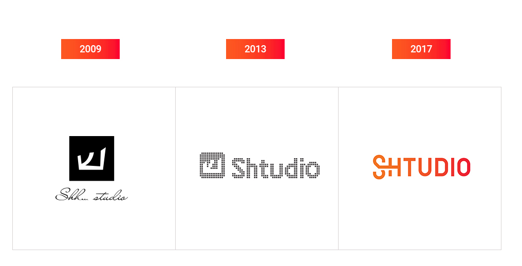
Timeline. In summary, here is the progression of our identity over the years.
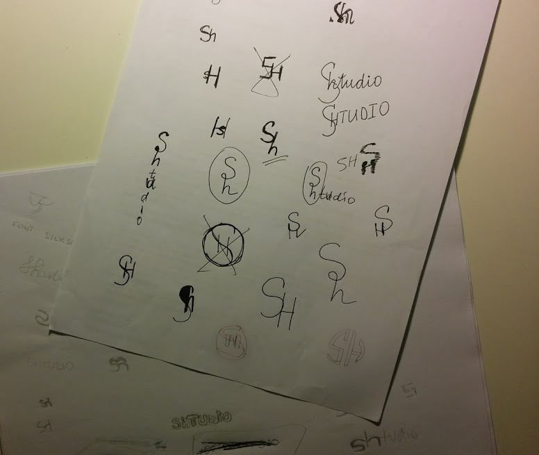
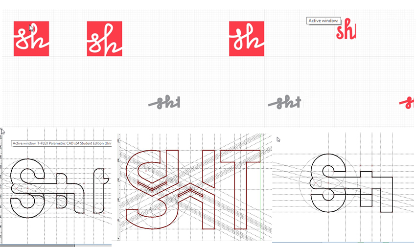
Step 1. We’ve decided to step away from the original design and instead come up with a logo that also works as an icon. [Sh]tudio with the [Sh] that can be used as a stand-alone icon. Here are some of initial ideas that were presented.
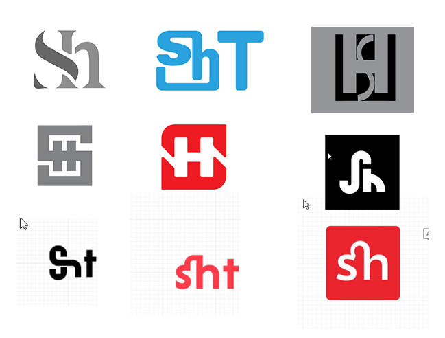
Step 2. Those first designs did not work for us, looking for a different direction.
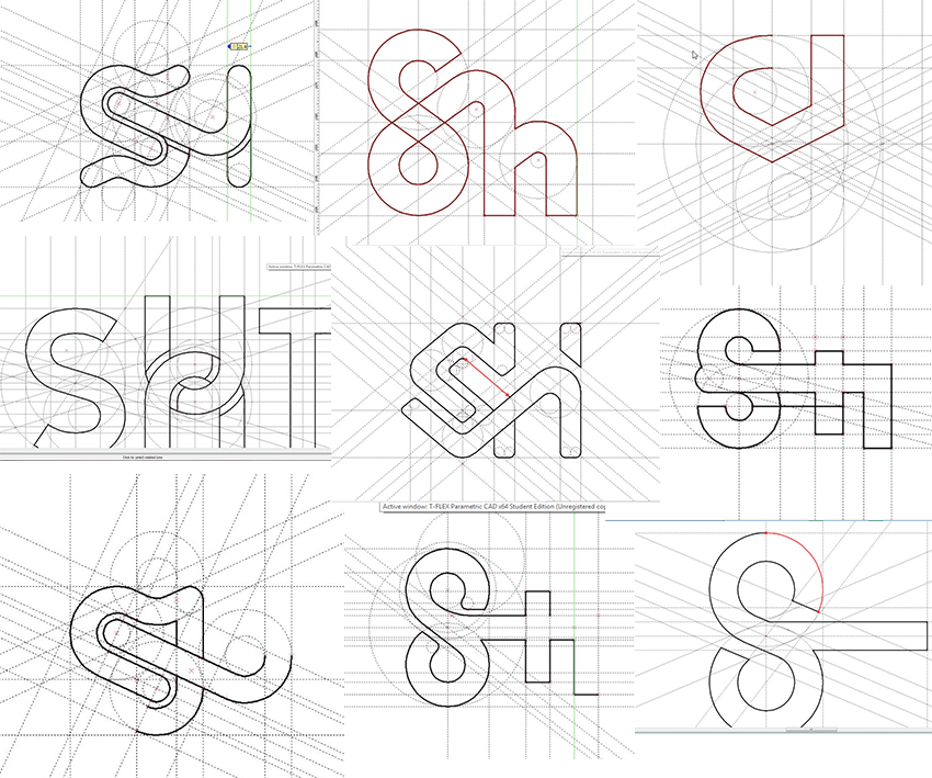
Step 3. Trying more variations, so far we didn’t come up with anything we can see working as a brand.
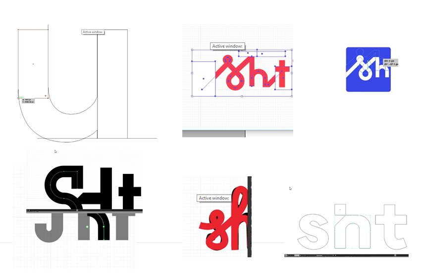
Step 4. We are now seeing some interesting typography here. There is potential that the “winding key” is our next indirect message. Winding up ideas. An infinity sign, never ending ideas that we inject into projects. This is finally taking shape. We are staying with this.
Step 5. Never easy to just accept something, we try a few more, but end up going back to the infinity symbol. It’s easy, it’s flexible, we just need to get it right.
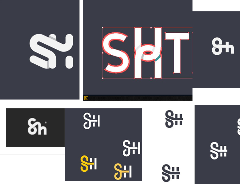
Step 6. Now that we have a good idea of the logo, we start working closely on individual letters and also designing custom made icons to go with it.
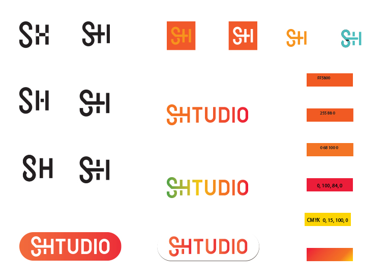
Step 7. Working out the final details of the icon, the colour theme and how the full logo will work.
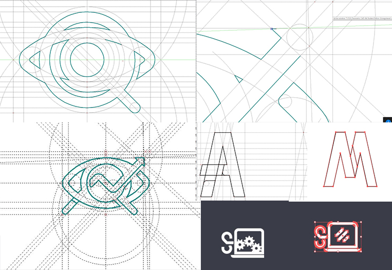
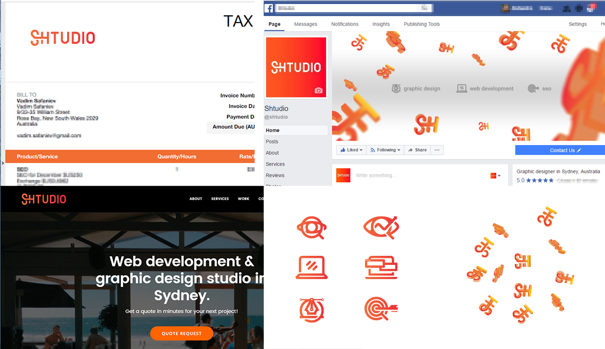
Step 8. Testing the new logo on our invoice template, facebook, website and so on. First set of icons now completed. Next stage will be playing around with the branding options with our new logo.
Done. We are very happy with the final result. Without having a clear direction to begin with, we ended up coming up with something unique, bright, smart and most importantly very simple, but flexible. We are now working on some motion graphics, stationary, online ads and even diving into 3D.
Comments are closed.